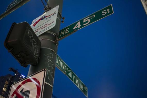
Geography student and The Daily reporter Shira Zur recently published a timely and data-driven article addressing the impacts of certain 911 calls originating around the University of Washington Seattle campus. Titled "To report or not report ‘suspicious people’ near campus," Shira's article incorporates geospatial data visualizations and analysis together with interviews from students, Seattle Police Department representatives and faculty experts. Here, Shira shares a peek behind the scenes of crafting the article, including the significance of geography coursework!
Story Inspiration
"Ever since getting more involved in Geography: Data Science, I have been eager to write an article that incorporates data visualizations, specifically maps, so I have been thinking a lot about article ideas that lend themselves well to be mapped out. In a previous class I took (COM 461: Data Journalism), I worked a lot with crime data, since it's very easily accessible through Seattle's Open Data portal. What sparked this particular story idea was a lingering question I had about where crime is aggregated in the U-District neighborhood around campus; I turned to the portal, downloaded SPD's 911 call data, and used Excel to analyze trends. I noticed that a large majority of calls made to SPD were reporting a 'suspicious person', which immediately sparked more questions: what is a 'suspicious person'? How do we define it as a society, and is that different than how the SPD defines it? From there, I followed the typical process for reporting an article – I found professors and resources that had strong background knowledge to help answer my questions, interviewed them, and continued editing and re-editing my article to tell the story of the answers I was getting. I think The Daily hasn't really had many stories with visualizations in them which might make this article slightly unusual, but it's definitely not unusual for me to create visualizations for my articles – that's my long-term goal, as I am hoping to one day be a data reporter :)"
Importance of Data Visualizations
"I hope my readers take away that it's not just an individual experience – there are definitely specific locations, such as intersections and streets in the U-District neighborhood, that see more crime. Of course, this takeaway should be accompanied with what type of crime is taking place, and in this case, so many calls are being made about 'suspicious people' rather than the crimes themselves. I hope that my readers can see that calling SPD about a 'suspicious person' isn't always an easy decision to make, and I urge them to take time to consider when they should or should not phone the police about something they see. I also hope that now that my maps have helped identify areas that are seeing a high number of police reports, students can form a stronger, more trusting relationship with the police in our area to help ensure everybody feels safe, and that the police can work with students to better inform them of when they should call the police."
Challenges
"Figuring out how I wanted to map the data was definitely a challenge as there are many ways to do it and I wasn't sure which one would be the most effective. I'm really grateful for Aya Masilela's help from CSSCR, as together we were able to try a couple of different techniques and find which one would best communicate the story I was trying to tell. And of course, working with ArcGIS Pro to create neat and easily readable layouts can always be challenging was it is time-consuming and consists of a lot of trial-and-error. However, once I had all they key parts I needed for the story, I found it easy to put it together as I knew what story I wanted to share and how all the key parts fit in."
"One of the things that helped inspire this article was the coursework I have been doing in GEOG 461 [Urban GIS]. After spending a week discussing Kernel Density Mapping, I realized that mapping the call data in a similar heatmap style would be really effective. The class has also taught me a lot about the considerations I should make when mapping this kind of data – from how to visualize it and make it readable and easy to understand to how I should approach the takeaways I make from my maps. Overall, I have gained a lot of new future article ideas from the projects I've been completing for the class, as I learn about new data sources I can use and new techniques and methods I can try out in ArcGIS Pro."
Future Career Connections
"My future career goal is to become a data journalist, and I think I wouldn't have made that decision if it wasn't for finding a passion for cartography and mapping through the Department of Geography. While I appreciate other forms of data visualizations in the news articles I read, I have always been most drawn to maps. Learning how to make maps through my classes, and then how to report on maps through writing for The Daily, is taking me one step closer to my future career goal. I am really excited to take more geography classes and see what inspiration I find for future stories that I can report for The Daily, and also other news outlets in the Seattle area."
